A Modern Take on Queen Anne
What is Modern, and why does the Queen Anne Historical Society (QAHS) care?
True, Modern architecture is not a style. Modern architecture is the belief that using the opportunities provided by a site, by a client and by constraints should inform design.
Understanding Modern architecture is not merely understanding contemporary works by architects; rather, it is understanding how a design was informed and conceived and how it is expressed in the authenticity of the design solution.
QA Modern Tour
For QAHS, the essence of Modern design and Modern living is worth documenting. The Society believes Queen Anne’s heritage is not only traditional and that we do well to capture the meaning of Modern while we can actually talk to the people who are doing the work.
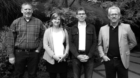
One approach to documenting Modern living and design was through our June 14, 2014 Queen Anne Modern tour. We invited guest architects to speak about their work and their ideas on Modernity.
Interpretations Of Modernism
During the tour, guest architect Sheri Olson, of Sheri Olson Architecture discussed one of her Queen Anne houses. Olson’s design has oversized sliding doors at the front and back of the house connecting the dining and living room to the outdoors. Even on a dark winter day, floor-to-ceiling windows provide a bright interior. At the same time, awnings shade living spaces during the summer. The systems of the home were designed to allow the family to connect to nature while minimizing their impact on the environment.
Olson’s design pays attention to the lifestyle needs of a contemporary family by obeying the rule of locating public living spaces on the main level and private spaces above.
Guest architect Allan Farkas, of Eggleston|Farkas Architects, highlighted that their design for a South Slope home is all about the untraditional floor plan. Dealing with a small site and the opportunity for views of the city, Farkas located the main living spaces on the third topmost floor. The unconventional floor plan maximizes views and provides privacy, despite its urban location.
Farkas also discussed the mechanics of the exterior rain screen borrowed from Canadian warehouses.
Guest architect Lane Williams, of Lane Williams Architects, also takes a less traditional approach to space organization, but he highlighted traditional materials in his design. Williams pays attention to the lifestyle needs of a contemporary family, but the home’s spatial organization squeezes the main living spaces between a single bedroom on the second level and two others tucked away in the basement.
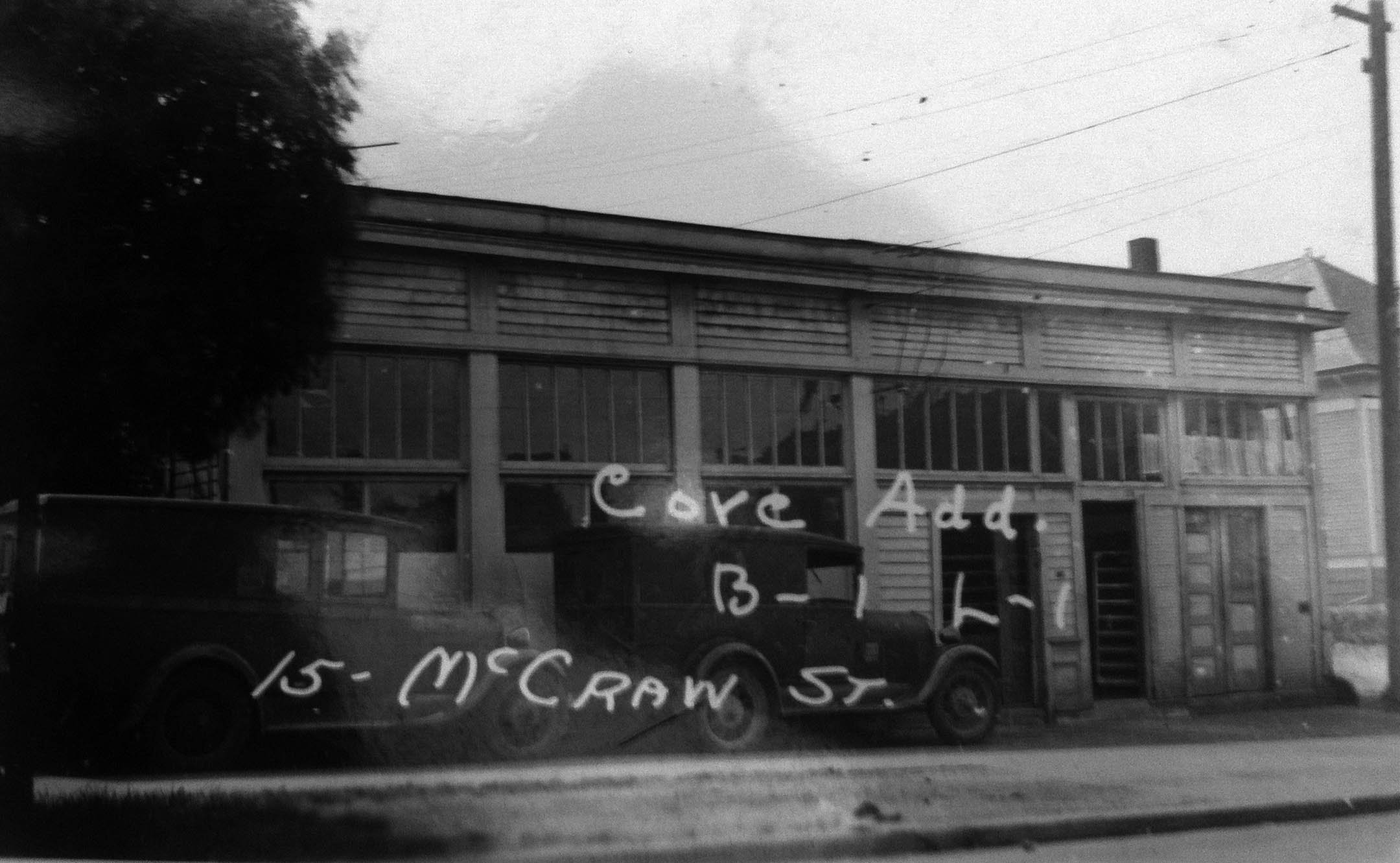
Williams’s design keeps economy of means and materials in mind by using the footprint of the house originally on the site, reclaimed brick for the façade and reclaimed wood for flooring and ceilings. Williams’s site also has the benefit of an old warehouse that he converted into an office space.
Like Williams, Geoff Prentiss’s Queen Anne design also embraces the live/work component. Where Williams’s design has a horizontal separation between commercial and residential building, Prentiss maintains the traditional commercial zone on the ground floor with apartments above.
Prentiss design attaches a new building to an early 20th-century grocery/apartment building. The original building abuts the sidewalk, while the new addition retreats from the sidewalk to leave a public courtyard for anyone moving slowly enough to notice.
The building’s simple, strong character is underscored by low-maintenance materials, such as cinder block, glass, laminated wood beams and copper.
Guest architect David Coleman, of David Coleman Architecture, discussed how he used the traditional-cottage type while engaging the site in a Modern way.
Needing to accommodate a steeply sloped lot allowed Coleman to surround the house with a variety of exterior living spaces. Each level of the home engages with the exterior landscape: a street-facing terrace; a lower-level, semi-private, side-yard patio; and an ultra-private, top-floor patio, with a view of Mount Baker.
Preserving Modern History
The guest architects spoke about work that was less than 20 years old; the tour started at Canlis and ended at the Swedish Club.
Canlis Broiler in 1951
Designed by Roland Terry, Canlis opened in 1950. It reflects the Modern break with traditional spaces with its completely open plan and the huge glass wall that captures the colors, light, materials and special character of Pacific Northwest water, sky and views.
The Swedish Club — designed in 1960 by Steinhardt, Theriault & Anderson — joins views of the city, lake and sky with rooms clustered about a grand lobby, which serves as a soaring link between the street and the club’s social rooms.
Both the restaurant and the club underscore the Modern desire to capture the unique qualities of a site in Contemporary design after 1945 and the end of World War II.
The Queen Anne Modern tour demonstrates the need for any historical society to collect information and objects critical to understanding a community. With the information gathered for the Modern tour and documented in the QAHS archives, future historians will be able to identify who created some of the most successful Modern designs in the neighborhood and what inspired them. The Society will continue this work in the coming years.


